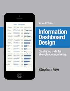
Information Dashboard Design: The Effective Visual Communication Of Data
Book details
Summary
Description
Dashboards have become popular in recent years as uniquely powerful tools for communicating important information at a glance. Although dashboards are potentially powerful, this potential is rarely realized. The greatest display technology in the world won't solve this if you fail to use effective visual design. And if a dashboard fails to tell you precisely what you need to know in an instant, you'll never use it, even if it's filled with cute gauges, meters, and traffic lights. Don't let your investment in dashboard technology go to waste.
This book will teach you the visual design skills you need to create dashboards that communicate clearly, rapidly, and compellingly. Information Dashboard Design will explain how to:
- Avoid the thirteen mistakes common to dashboard design
- Provide viewers with the information they need quickly and clearly
- Apply what we now know about visual perception to the visual presentation of information
- Minimize distractions, cliches, and unnecessary embellishments that create confusion
- Organize business information to support meaning and usability
- Create an aesthetically pleasing viewing experience
- Maintain consistency of design to provide accurate interpretation
- Optimize the power of dashboard technology by pairing it with visual effectiveness
Stephen Few has over 20 years of experience as an IT innovator, consultant, and educator. As Principal of the consultancy Perceptual Edge, Stephen focuses on data visualization for analyzing and communicating quantitative business information. He provides consulting and training services, speaks frequently at conferences, and teaches in the MBA program at the University of California in Berkeley. He is also the author of Show Me the Numbers: Designing Tables and Graphs to Enlighten.


We would LOVE it if you could help us and other readers by reviewing the book

